

Create Circus Journal · Travel & Tourism
Your Booking Engine Is Not Your Website: How Tour Operators Turn Interest Into Direct Bookings
A booking engine can take a payment.
It can show availability, collect guest details, manage capacity and send a confirmation.
What it cannot do on its own is make someone want your tour.
That happens earlier.
A traveller needs to understand the experience, imagine themselves inside it, decide whether it suits them, trust the company running it and feel comfortable enough to stop comparing alternatives.
Only then does the booking engine become useful.
This distinction matters more than ever for tour operators.
Arival’s latest global operator research found direct website bookings losing share while online travel agencies continued to grow their share of bookings.
That does not make the operator’s website less important.
It raises the standard for what an owned website needs to do.
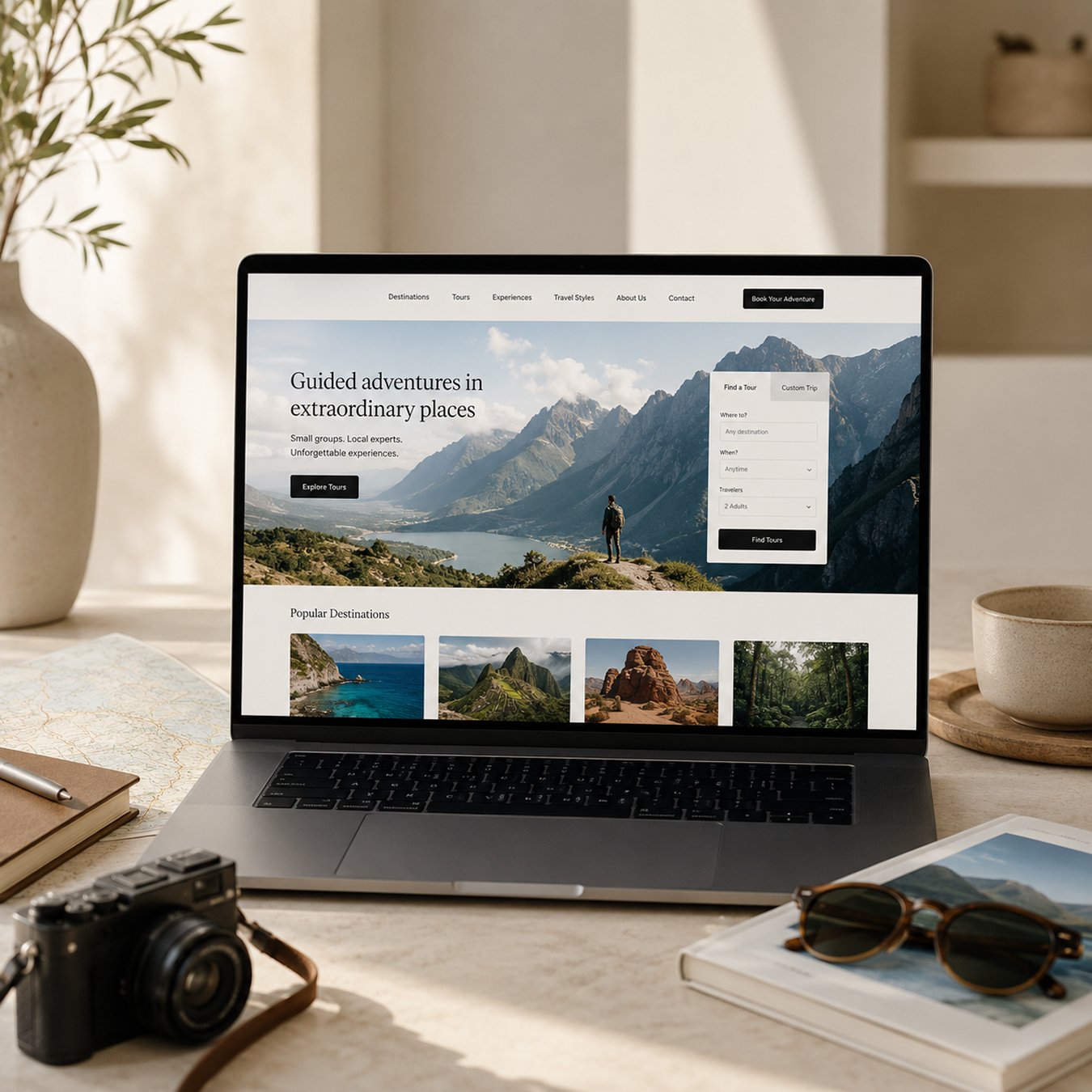
That is why we do not think of a tour operator website as a digital brochure connected to reservation software.
We think of it as a decision-making journey that ends in a booking.
A direct booking is earned before checkout opens
The booking journey begins long before somebody clicks “Book now”.
A traveller may first meet your business through Google, social media, a destination article, a recommendation, a hotel partner, Viator, GetYourGuide or another marketplace.
When they arrive on your own website, they are rarely asking only one question.
They are trying to work out:
What exactly will I experience?
Why is this different from the other tours I just saw?
How long does it take?
Where does it begin?
What is included?
Who is this suitable for?
Can I trust this company?
What happens if my plans change?
Is my date available?
And eventually, how do I book?
A strong website answers those questions in the right sequence rather than forcing a traveller to assemble the experience themselves.
That sequence is the real conversion funnel.
A tour page is a product page, landing page and sales conversation at the same time
Tour websites have an unusual UX challenge.
They have to sell something emotional and practical at once.
Travel is anticipation. Strong photography, video, storytelling, tone of voice and visual identity help people imagine what an experience might feel like.
But desire alone does not complete the sale.
The traveller still needs decision-making information.
A useful tour page may need to communicate price, duration, start time, availability, meeting point, group size, language, inclusions, exclusions, accessibility, itinerary, cancellation terms, reviews and frequently asked questions.
Putting all of that onto a page is easy.
Organising it properly is the hard part.
If practical information sits underneath several screens of storytelling, somebody ready to make a decision has to hunt for answers.
If everything has equal visual importance, the page becomes difficult to scan.
If the booking button asks for commitment before the traveller understands what they are buying, the site is asking too much too soon.
This is where information architecture and UX matter.
The question is not simply:
“What content should we include?”
It is:
“What does somebody need to know at this point in the decision, and what should they be able to do next?”
The booking engine should feel like a continuation, not a handoff
Many tour businesses rely on specialist booking platforms for very good reasons.
Systems such as FareHarbor, Rezdy and Bókun can handle availability, capacity, payments, guest information, distribution and operational workflows that would make little sense to rebuild from scratch.
The strategic problem is rarely the fact that an external platform exists.
The problem is what happens when the website hands the customer to it.
A traveller clicks Book.
The visual language changes.
The product needs to be selected again.
The interface becomes denser.
The navigation disappears.
The experience suddenly feels like another company.
Every one of those changes introduces a small moment of uncertainty at exactly the point where somebody was ready to buy.
This is why booking platform integration is a UX decision as much as a development task.
Depending on the platform and business, the right implementation might be an embedded calendar, on-page widget, modal, carefully designed handoff or deeper API integration.
Rezdy, for example, supports several website widgets specifically so operators can keep the website visible around the booking process.
The goal is not to pretend that two technologies are one technology.
The goal is to preserve context.
The traveller should still understand what they are booking, the date they selected, what it costs and what will happen next.
Mobile is not just a breakpoint. It is often the booking context.
Travel creates mobile situations many other industries do not need to design around.
A potential guest may be researching from an airport, already walking through the destination, sitting in a café or deciding tomorrow’s activities with several other people.
The context is different.
Price, duration and availability have to remain easy to find.
Long itineraries need to be scannable.
Meeting points and maps become particularly important.
Date selection needs to work comfortably on a small screen.
Heavy destination media has to be balanced against mobile performance.
This is especially relevant in tourism because booking platforms themselves report a strong mobile booking mix and increasingly emphasize mobile-optimized checkout.
Responsive design is therefore not enough.
The booking journey itself has to be designed for the situations in which travellers actually use it.
When the destination is shared, the brand has to create the difference
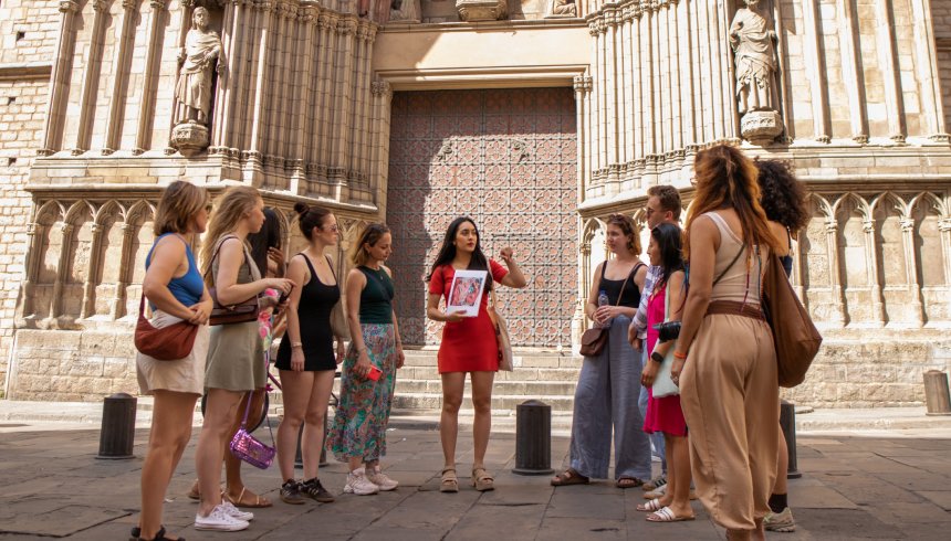
A tour operator rarely owns the attraction.
The Colosseum is also being sold by somebody else.
The same neighbourhood may appear on several food tours.
The same coastline can be photographed by dozens of boat operators.
If every company leads with the same destination image, the same “unforgettable experience” language and the same five-star badge, the customer’s decision quickly collapses back to price, reviews and availability.
Branding gives the business another way to compete.
Not branding as decoration.
Branding as an answer to:
Who are we for?
What kind of experience do we create?
What do we believe makes a great tour?
Why does this feel different with us?
That point of view can shape positioning, language, photography, identity, guide profiles, tour naming and even the way an itinerary is written.
When travellers recognise a distinct company rather than another activity listing, direct booking becomes a brand decision rather than only a price comparison.
OTAs are a distribution channel. Your website is an owned channel.
There is a temptation to frame direct booking as a fight against online travel agencies.
We do not think that is particularly useful.
Marketplaces can be powerful discovery channels.
They aggregate demand, introduce travellers to operators they have never heard of and can help experiences reach an international audience.
The risk appears when the marketplace becomes the only strong route to purchase.
Your own website can do things an OTA listing cannot do as deeply.
It can communicate the complete brand.
Connect multiple tours intelligently.
Introduce guides and local expertise.
Publish useful destination content.
Support campaigns and partnerships.
Build first-party analytics.
Create landing pages for different markets and audiences.
And help somebody discover a second experience after finding the first.
The objective is not necessarily to leave the OTAs.
It is to make the direct channel strong enough to deserve a larger role in the business.
SEO should follow the way travellers search for experiences
SEO for a tour operator should not be bolted onto the website after design is finished.
The architecture itself determines many of the searches a site can realistically become visible for.
Travellers may search by destination.
Activity.
Neighbourhood.
Audience.
Occasion.
Season.
Or a very specific combination of them.
A multi-city operator therefore needs more than a collection of attractive tour pages.
City architecture, tour templates, destination content, internal linking, technical SEO and scalable design systems have to work together.
Good content creates additional entrances into the same commercial journey.
A destination guide can lead naturally into an experience.
A comparison page can help somebody choose between tours.
A neighbourhood article can introduce an activity taking place there.
Traffic is most useful when the website knows where to take it next.
Launch is when optimisation becomes possible
A travel website should not become static the day it launches.
Once real people start using it, the business gains something the design phase cannot provide: behaviour.
Analytics can show which tour pages attract visitors and which lead them into availability.
Tracking can show the gap between checking a date, entering the booking process and completing a reservation.
Mobile and desktop behaviour can be compared.
Organic, paid, direct and referral visitors may behave differently.
A tour with strong traffic but weak booking intent may have a positioning problem.
A tour with strong booking intent but poor completion may have a booking-flow problem.
This is why analytics, CRO, technical SEO, performance monitoring and ongoing UX refinement belong in the conversation from the beginning.
Sometimes the right answer is not a redesign
Not every tour operator needs a new website.
If the brand is clear, architecture works, performance is healthy and the booking journey is fundamentally sound, a focused optimisation project may create more value than rebuilding everything.
That might mean improving tour-page hierarchy.
Moving reviews closer to decision points.
Fixing mobile friction.
Improving a destination landing page.
Reworking the booking integration.
Or setting up better tracking so the actual problem becomes visible.
A rebuild makes more sense when the problems are structural.
The brand no longer fits the business.
The content architecture cannot scale.
The technology has become fragile.
The booking journey has accumulated years of workarounds.
Or the website is preventing the team from improving it.
The useful question is not:
“Do we need a new website?”
It is:
“What is preventing more people from confidently reaching the booking?”
A travel website is a system, not a page redesign
The strongest tourism projects bring several disciplines together.
Brand strategy and positioning define why somebody should choose the experience.
UX and information architecture organise how travellers explore destinations and tours.
UI and visual storytelling create desire without sacrificing clarity.
Development turns the experience into something fast, responsive and maintainable.
Booking, CRM and API integrations connect the customer journey with the operational systems behind it.
SEO and content strategy create more relevant paths into the site.
Analytics and CRO show where the experience can keep improving.
For businesses operating across several cities or brands, the same thinking extends into scalable identity systems, reusable page templates and destination architecture.
This is how we think about travel and tourism experience design at Create Circus.
Not simply as a website for a tour company.
As the digital system connecting discovery, brand, decision and booking.
The booking engine should make saying yes easy
The booking engine is essential.
But it should not have to persuade somebody from scratch.
By the time a traveller reaches it, the website should already have done the harder work.
The experience should feel desirable.
The offer should be understood.
The practical questions should be answered.
The company should feel trustworthy.
The traveller should know what they are choosing.
Then the technology has one job left:
make the final decision easy to complete.
Sources and further reading
Arival: Direct Bookings Dive, OTAs Rise
FareHarbor: Increasing Tour Bookings
Travel & Tourism Experience Design
Where is your booking journey losing people?
Whether you are rebuilding an established tour website, developing a new travel brand, integrating a booking platform or improving an existing direct-booking journey, we can look at the complete system with you.
Brand, UX, design, development, booking integration, SEO and conversion should work as one experience, not as separate projects.