

Create Circus Journal · E-Commerce Setup
eCommerce Design Trends 2026: What Actually Creates Sales
Every year brings another list of ecommerce design trends.
New type treatments. New animation styles. New layouts. New technologies that promise to change how people shop.
Some become genuinely useful. Others disappear almost as quickly as they arrived.
For ecommerce businesses, that distinction matters.
A store is not a design experiment. It has to communicate a product, build confidence, help people make decisions and make buying feel straightforward.
That is why the ecommerce design trends we care about in 2026 are not simply the things making websites look newer.
They are the ideas changing how good stores work.
1. Mobile-first is no longer a trend. It is the baseline.
For years, mobile-first appeared on lists like this as something ecommerce businesses needed to prepare for.
That period is over.
Mobile is now one of the primary environments in which customers discover, compare and buy products.
Yet a responsive website is not automatically a good mobile ecommerce experience.
The real challenge is prioritisation.
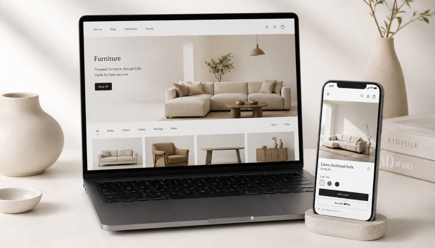
A desktop page may have enough room for a large gallery, product information, variants, reviews, recommendations and several promotional messages at once.
On a phone, customers experience those elements sequentially.
That means hierarchy matters more.
The product has to be understood quickly.
The primary action needs to remain obvious.
Variant selection should not become a puzzle.
Important delivery and return information should not disappear into the bottom of a very long page.
Baymard’s 2026 product-page benchmark still found that only 38% of leading mobile ecommerce sites achieved a decent or better product-page UX.
So mobile-first is not solved simply because a layout technically adapts to a smaller screen.
2. Product pages are becoming decision environments
The product page remains one of the most commercially important parts of an ecommerce store.
But the strongest product pages increasingly behave less like product catalogues and more like decision-making environments.
The customer needs to understand:
What is this?
Why is it useful?
Which option is right for me?
What does it look or feel like in use?
When will it arrive?
Can I return it?
Why should I trust this brand?
And what should I do next?
A beautiful product page that forces somebody to hunt for those answers is still weak ecommerce design.
This is why we are seeing greater emphasis on clearer product hierarchies, better image galleries, visible variant options, useful comparison content, social proof and practical information closer to the buying decision.
The design is doing more than presenting the product.
It is reducing uncertainty.
3. Performance is becoming part of the visual design conversation
There is always tension between richness and speed.
Ecommerce brands want large photography, video, movement, custom typography and interactive details.
Customers want the site to respond immediately.
Good ecommerce design in 2026 has to accommodate both.
That changes creative decisions.
A video is not automatically worth loading because it looks impressive.
An animation does not deserve to exist simply because development can build it.
Ten font files are not harmless because they happen to match the brand guidelines.
Designers and developers increasingly have to make these decisions together.
Performance is not something that happens after the design is approved.
It is one of the constraints shaping the design from the beginning.
4. Ecommerce is becoming more editorial, but the hierarchy still has to sell
Not every ecommerce experience needs to rush a customer toward the cart.
Some products benefit from exploration.
Fashion, beauty, lifestyle, interiors and premium consumer brands can use richer storytelling to create desire before asking for a purchase.
Shopify’s 2026 UX trend research describes this movement toward more intentional and sometimes slower browsing experiences.
We think that is useful, with one important condition:
Editorial does not mean directionless.
A customer can enjoy discovering the brand while still knowing where they are, what is being sold and how to move toward a decision.
The strongest stores combine atmosphere with commercial clarity.
They do not make customers choose between the two.
5. Personalisation should reduce work for the customer
Personalisation is becoming more sophisticated, particularly as ecommerce platforms gain access to richer behavioural data and AI tools.
But the useful version of personalisation is not simply putting someone’s first name into a banner.
It reduces effort.
A returning customer can find the products relevant to them more quickly.
A store can remember useful preferences.
Recommendations can reflect actual behaviour instead of showing the same best sellers to everybody.
Content can respond to geography, customer type or stage in the buying journey.
Done well, personalisation makes the store feel easier.
Done badly, it feels intrusive or simply produces more promotional noise.
That means the design problem is not how much can be personalised.
It is deciding where personalisation genuinely improves the experience.
6. Search is moving from matching words toward understanding intent
Traditional ecommerce search depends heavily on customers knowing how the catalogue is organised.
AI-assisted search is beginning to change that.
A customer does not necessarily need to search for a precise category or product name.
They can increasingly describe what they are trying to achieve.
That means ecommerce UX is beginning to accommodate more natural discovery journeys alongside conventional search, navigation and filtering.
For the business, this creates a less visible design requirement too.
Product data needs to be good.
Titles, attributes, categories, specifications and descriptions help both customers and increasingly intelligent discovery systems understand the catalogue.
Good ecommerce design therefore extends beyond what appears on screen.
The information underneath the interface matters as well.
7. Distinctive brands are becoming more valuable as production becomes easier
AI has made it much easier to generate copy, imagery, layouts and campaign concepts.
That is useful.
It also means producing something technically polished is becoming less of a differentiator.
When dozens of brands can generate similar photography, similar product copy and similar ecommerce sections very quickly, sameness becomes easier too.
We expect this to make brand strategy and art direction more important, not less.
A strong ecommerce identity needs enough personality to survive across the website, social content, campaigns, packaging, email and AI-assisted production without becoming inconsistent.
This is one reason we increasingly think of branding and ecommerce design as connected systems.
The website should not simply apply a logo to a familiar store template.
It should make the character of the business visible in how the experience behaves.
8. Motion has to earn its place
Movement is not disappearing from ecommerce design.
But gratuitous movement is becoming harder to justify.
The best animation gives feedback, explains something or adds personality at a moment where it improves the experience.
A product interaction can become clearer.
A transition can help preserve context.
A small response to an action can make the interface feel more considered.
What we would avoid is using animation as proof that a website is premium.
If movement slows down navigation, obscures content or becomes repetitive after the first visit, it has stopped serving the customer.
What no longer deserves to be called an ecommerce trend?
Some ideas from older ecommerce trend lists have simply become normal expectations.
Responsive design is expected.
Clear product photography is expected.
Secure checkout is expected.
Fast loading should be expected.
Accessible interaction should be expected.
Useful mobile design should be expected.
Calling these trends can distract from the fact that many ecommerce stores still execute the fundamentals poorly.
Baymard’s current benchmarks are a useful reminder of that. Even some of the largest ecommerce businesses still have substantial usability problems across product pages and mobile experiences.
How we decide whether an ecommerce trend is worth using
When we evaluate a new ecommerce idea at Create Circus, we do not start by asking whether it looks current.
We ask what it improves.
Does it make the product easier to understand?
Does it reduce uncertainty?
Does it help somebody find the right item?
Does it strengthen the brand?
Does it remove friction?
Does it improve the mobile experience?
Does it make the store easier for the business to manage and evolve?
If the answer is no, being fashionable is not enough.
The ecommerce design trends worth keeping are usually the ones that stop feeling like trends at all.
They become better ways of building the experience.
Sources and further reading
Shopify: UX Design Trends: 6 Ecommerce Trends for 2026
Baymard Institute: Product Page UX 2026
Baymard Institute: Mobile UX Trends 2026
Ecommerce Strategy · UX · Web Design · CRO
Does your store need a new look, or a better experience?
If your ecommerce site feels dated, difficult to navigate or simply is not converting as well as it should, the answer is not always to follow the latest visual trend.
We can help you understand what needs to change across brand, UX, design, development and conversion before deciding how large the project actually needs to be.